Design Makes a Difference

A well-designed page is a joy to the eye and an aid to the brain. We’ve all come across magazines or books or webpages that make reading a chore. Others we may admire for their grace. And some we may not notice at all because their transparency allows the meaning of the text to flow unimpeded, not drawing attention to the design itself.

If you are producing your own book, newsletter, or webpage, don’t skimp on design. It’s worth it to pay someone who knows design to help you. Or invest in a book on page design yourself. At least use a standard template often offered by self-publishing services.

Be alert, however, that not all graphic designers have the same training or experience. Someone expert at magazine covers or web pages may wrongly apply those design principles to a book page. They are not the same. Try to find someone who knows proper proportions for margins, line spacing (or leading), and so forth—for books.

One error amateur and professionals alike can make regards column width. If a column is too wide, the eye gets lost in the middle of the line and readability goes down. If it is too narrow, the eye shifts down too frequently, also hindering comprehension. What’s the happy medium?

For book layout, Simon Garfield offers sound advice in Just My Type: “Readability will be aided by regular paragraphs and sufficient margins, and by an acceptable line length (this is naturally dependent on the size of the text, but is ideally considered to be between ten and twelve words).” (p. 55).

Thus, when using small font (such as 9 pt. or less), don’t have a wide column. Use two or three narrow columns. Or if you have a very wide page, as with a workbook, you can use a larger font, but still, readability requires you use two columns for any lengthy text.

If, however, you intend for users to write in the workbook, a brief question can be a full column (with a somewhat larger font), followed by space for writing. It can also be fine to alternate between (two-column) text-heavy sections and (one-column) for writing out exercises and questions.

Another alternative (especially if you have lots of photos, tables, graphs, and the like) is to have a single column that is at most two-thirds the width of your frame with your graphics going full-frame, as needed.

Design is not an optional extra. Reading is better by design.

More Resources

“Line Lengths and Column Widths” from Magazine Design

“Design Options for Self-Publishers” from Publishers Weekly

“6 Keys for Book Page Layout” from TCK Publishing

Graphic Design for Everyone by Cath Caldwell

Just My Type (3)

We live in a divided society. We are divided about politics, about family values, about religion. The very fabric of our culture seems at risk of being torn apart. But there is one area of disagreement that is more intense, more divisive than any other.

That is whether or not we should type one space or two at the end of a sentence.

Watch out! Feelings run so high that in an altercation you could easily lose the thumb you use to hit the space bar.

How do I know? Microsoft recently announced that the default spacing in Word was being revised from two spaces to one. I posted that on FaceBook and asked folks to vote for their preference. I got a lot of good-natured responses, nonetheless, with a lot of feeling.

    “Two. My liberty is being assaulted. ?”

    “The first good decision Microsoft has made.”

    “My platform will always be pro Two Spaces. Just like I am pro TP Roll Goes Over Top, and pro Please Do Not Hack Up the Butter/Cream Cheese. There is a right way to load the dishwasher, and a right way to end your sentence.”

    “I’ve just emerged from another Facebook fracas over this. I can’t imagine why anyone still uses two spaces, but people get really emotional about their God-given Second Amendment right to hit the space bar twice after a sentence.”

How did the vote turn out? It was very close.

    27 voted for one space
    22 voted for two spaces

What I found most interesting, though, was that over 90% of authors and publishing professionals in my small, unofficial, unscientific survey voted for one space. Why? They are more likely to be familiar with the principles of type layout and design. As several commented, two spaces is a holdover from typewriters which use non-proportional fonts like Courier.

Here’s how Jennifer Gonzalez explains it: “Back when we used typewriters, every character was given the exact same amount of space on the page. That meant the letter i was given the same amount of space as the letter m, even though it clearly didn’t need it. This is called monospaced typesetting and it’s, well, spacey. We needed that extra space between sentences to make it easier to see the beginning of new sentences.”

As someone commented on my post, that’s how typesetting has worked for generations. The professionally produced books, magazines and newspapers you’ve read “have had only one space after a period your entire lives!”

A number of people seemed to agree that one space was correct but force of habit and early training has made it nearly impossible for them to change. That’s my situation. I try to do one space but often don’t. If I remember when I’m done with a piece, I do a global search to replace two spaces with one. Since I often forget, I am sure that if you look through my previous blogs, you will find much inconsistency. Such is life . . . at least my life!

photo credits: Pixabay RyanMcGuire (argument); Pixabay Wild0ne (typewriter)

Just My Type (2)

For many of my generation, my world of type was proscribed by Courier, the almost universal typeface of the typewriter era. I did notice, though, in the 1960s when the Minneapolis Star and Tribune started using a san serif face for their headlines. Now that was pretty cool. Not as cool, however, as the psychedelic typefaces that started popping up on album covers that same decade.

I learned a little bit about such things when I was editor for our high school newspaper. But my real education came from Kathy Lay Burrows, the first designer I worked with at InterVarsity Press. She loved type. She knew the history of each face, who the designers were and the story behind each one. The elegance of Garamond and Bembo made her swoon.

The only time I doubted her instincts was when a crusty old proofreader nearly swore to this freshman editor under his breath that Souvenir was only suitable as a display type and was never intended by God or anyone as body text!

Simon Garfield’s Just My Type is full of just such opinionated fun while he fills in the backstory of the designs and the designers. Comic Sans, for example, comes in for its share of ridicule. That well-intended typeface is casual, unintimidating, almost flip—and for many, irritating if not revolting.

Helvetica, on the other hand, is practical and suited to mass communication. It is comfortingly neutral, like the Swiss homeland from which it comes. Typefaces, you see, communicate much more than the content of their texts. They are a medium that is part of the message.

Lots of ads, signs, stationary, books, album covers, products, and other type examples are sprinkled throughout the book. These help us keep straight the hundreds and thousands of options that are out there—something that even those well versed have difficulty doing.

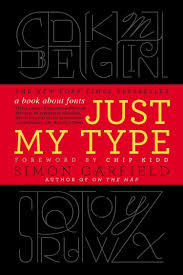
And how could I have not known that the ampersand (&) is actually an elegant combination of the letters e and t which comprise the Latin word et, meaning “and”? I do now, & am a better person for it.

If you’ve ever wondered what’s behind this world of type or, like me, had a good grounding and wanted more, here is a fun package to do just that.

image: Pixabay Tatutati

Just My Type (1)

I have a confession. . . my guilty pleasure. I love Times New Roman.

Don’t hate me, though, please. I have reasons. Good reasons. Really.

When reading books or other long-form material, those wonderful serifs mean I don’t have to work as hard identifying words. These unconscious clues let the text go down as smoothly as yogurt (filling and full of protein).

Many other delightful, elegant, and functional serif faces are available like Bembo, Bodoni, Garamond, and Georgia. But Times New Roman stays out of my way. I don’t see it. I only see the text. I’m not distracted because it is so completely ordinary and therefore invisible.

For headlines and huge signs in public places—yes, by all means, give me Helvetica or Univers or Futura. These san serif faces are wonderful, authoritative and to the point. They get me where I want to go whether it is the exit, the entrance, or (most importantly) the men’s room.

When I first started in publishing almost fifty years ago, I knew almost nothing about typefaces until our designers started tutoring me in their nuances, their histories, their dos and don’ts.

Today, of course, we all think we are graphic designers. Since every word processing program comes complete with multiple typefaces (like Arial) and multiple fonts (like Arial Black, Arial Narrow, Arial Rounded and MT Bold). And if such a font isn’t included, we can just highlight and click bold or italic to meet our needs.

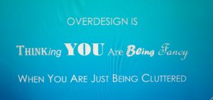
Having dozens or hundreds of options to choose from was just too much temptation for many. As an editor I often received manuscripts combining a riot of faces and fonts. What authors thought of as fancy or creative was plain distracting and ugly. Our friends at Apple and Microsoft had unleashed the untamed graphic designer in all of us.

Eventually folks caught on that simple was better. Less was more. Pick one typeface and go.

Not long thereafter I began receiving digital submissions, on a floppy disk (which came on the market about the same time as steam engines) or as an attached file. I liked that much better. Why? Because, you see, once I pulled up the manuscript on screen, no matter how carefully it had been laid out by the author, I could change it all to Times New Roman.

photo credit: Pixabay-PublicDomainPictures

Two Keys to Outstanding Cover Design

It is a truth universally acknowledged that people in possession of a good manuscript must be in want of an outstanding cover. A great cover can make an amazing difference. So can a bad one.

A few years ago I heard Ken Peterson of Tyndale House Publishers offer two simple keys to success—coding and positioning.
Continue reading “Two Keys to Outstanding Cover Design”

Books Without Covers

Every few months we get together a whole bunch of us from editorial, marketing, sales, production and design–anyone substantively involved in making or selling a book–to evaluate the releases from a season in the previous year. Once we had a cover designer attending for the first time. In trying to explain to the designer what the meeting was all about, someone said with a wry smile and in a voice everyone could hear, “This is the meeting in which we do judge a book by its cover.”
Continue reading “Books Without Covers”

The Outsource Question

Celebrate logistics, as I’ve said before, because logistics make the romance of publishing possible. A publisher can also outsource its logistics so it can focus on the sides of publishing it loves best and does best—probably editorial, sales and marketing. But just because you outsource doesn’t mean you can forget about operations, fulfillment and accounting. You just need to be involved in a different way at a different level.

Tom Woll has a number of suggestions for taking some (but not all) of the pain out of these functions.

* Outsourcing Accounts Receivable.
The pain of accounts receivable (AR) is that trade and other large accounts don’t pay in 30 days. “The average collection period in the book industry is between 90 and 120 days from the time of invoice. . . . The difficulty of collecting accounts receivable is, indeed, one of the primary reasons publishers use distributors . . . to cope with this job of collection.” (pp. 276-77) But you still have to monitor closely what the distributor owes you. And if the distributor goes bankrupt, you’ll likely see little if any of your money.

* Doing AR Yourself.
If you handle your own collections, it is vital to “monitor your accounts receivable every day” (p. 277), focusing on accounts that are more than 90 days overdue. As I’ve said before, it’s all about cash flow, baby.

* Outsourcing Warehousing and Fulfillment.
Customer expectations these days are that an item ordered will be shipped within twenty-four hours. Again, this is not an easy task, and many choose to outsource warehousing and shipping. But be careful.
    1. Don’t put your entire stock with one distributor. Again, if the distributor goes bankrupt, “your entire stock of books will be frozen (locked up) by the bankruptcy court and unavailable to you for some length of time” (p. 278). So you may want to handle some yourself or hire a second service to handle, for example, book clubs, premium sales and review copies.
    2. In any case, make sure the fulfillment service you use understands the fragility of books. A torn cover can make a book unsaleable.

Outsourcing was all the rage several years ago. And it can be very helpful for small or large publishers. But there are always drawbacks with every choice, and the industry is full of horror stories about outsourcing gone very wrong. Publishers should consider the pluses and minuses carefully when deciding how to handle logistics.