This week I am scheduled to receive my Covid-19 vaccine. To mark the occasion I am republishing here my blog from June 23, 2016.
My sister died because of a vaccine . . . a vaccine she never received. On a September morning in 1952, at the age of seven, Lucy Rae Le Peau contracted polio and died that afternoon. The vaccine that would have saved her life would not be developed for another year.
 It was a vaccine my grieving mother prayed for desperately, especially because her three other children, including me, were still vulnerable to the terrifying disease. Every year thousands of children across the United States were struck with it, peaking the year my sister died with over 57,000 cases, of whom 3,145 died.
Jeffrey Kluger’s Splendid Solution tells the captivating story of how a determined Jonas Salk, despite his junior status in the field and controversial approach, skillfully pushed through his inactive or killed virus vaccine. His rivalry with the intimidating Albert Sabin, who opposed Salk at nearly every turn, provides even more drama to a tale that has plenty of its own.
Another important subplot interwoven with the main narrative is how Franklin Roosevelt, himself a polio survivor, established the Georgia Warm Springs Foundation in 1927 with his friend Basil O’Connor. In 1938 this fundraising juggernaut was transformed into the National Foundation for Infantile Paralysis (NFIP) still under O’Connor’s direction. Later it became the well-known March of Dimes. The foundation was instrumental in funding Salk’s team and others. O’Connor also facilitated collaboration in a somewhat competitive and secretive field, bringing leading scientists together to share results and provide overall guidance.
As a side note, the wife of IVP author Kenneth Bailey, Ethel (née Milligan), was a microbiologist working under Salk in Pittsburgh. She and the rest of the research team were among the first to receive the vaccine before it was tested on others to assure its safety. Then followed carefully monitored tests on several hundred children in the area.
 With those positive results in hand, in 1954 the NFIP set up perhaps the most extensive field tests in medical history involving almost two million school-aged children. On April 12, 1955, exactly ten years after Roosevelt died, the announcement was made public. It worked. The press conference, one of the most extensively covered media events of the decade, was held at the University of Michigan which was tasked with analyzing the field results. President Eisenhower announced the formula would be given away free to countries around the world.
Within ten years less than a hundred cases were reported in the United States. By 2015 there were less than a hundred worldwide. Salk didn’t think of himself as a hero, but this vaccine pioneer was a hero nonetheless, saving tens of thousands of lives and preventing disability for over ten times that many.

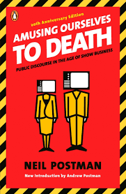
 In the introduction for the twentieth-anniversary edition of book, Postman’s son points out that though we are not dominated by network television anymore, the underlying issues of our entertainment-saturated culture remain the same. Has media improved our democracy? Has it made our leaders more accountable? Are we better citizens or are we better consumers? Have our schools improved as a result?
 A colleague, Jim Hoover, often said, “An editor is the author’s advocate to the reader—and the reader’s advocate to the author.” The job of editors is not to shape manuscripts the way they would write them. Rather when alerting authors to potential problems, editors aim to show authors what questions people might raise the first time they read the text. That is just virtually impossible for authors to do who are overly familiar with what they’ve written. “Isn’t it obvious?” No. Not always.


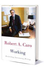
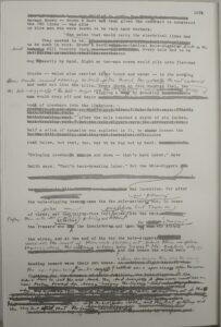 Caro’s other passion is explaining how political power works because it has a tremendous effect on our lives. Robert Moses was determined to reshape New York City with bridges, highways, parks, and other public works. To do so, during his forty years in power, Moses displaced a half million of New York’s fourteen million people—forcing them out of their homes, destroying communities. In a democracy, Caro wants us to know how that kind of power (of an unelected official) works.
 Why? We live in a world that often seems so random and chaotic. None of us knows who will get cancer next, be in a car accident, or where the next war will break out. Experts famously fail in making such predictions. We can increase the odds of living a healthy life, but we have no guarantees.
 One exception is reading. One tool I’ve found that helps keep me making progress is the Goodreads Reading Challenge.
  In recent years I’ve aimed at about fifty, and I’ve hit that target. This year I only read forty. That’s no cause to beat myself up. I’m sure I’ve been reading more than I would have otherwise just because that target is out there.